# Recent Trends in Global CO2 Emissions: Analyzing EDGAR's Latest Data
Written on
Chapter 1: Introduction to the Latest EDGAR Data
After several months of anticipation, the new dataset version 7 from JRC/EDGAR detailing CO2 emissions from fossil fuels has finally been released. This update will serve as a brief overview of my more comprehensive analysis, which I plan to publish at a later date.
As mentioned in my prior analyses, the temporary decrease in emissions observed in 2020 is expected to be followed by a significant surge in 2021. This trend is clearly reflected in the latest figures, marking 2021 as a record-breaking year for global CO2 emissions, with levels never seen before.
The data also includes emissions from Land Use, Land-Use Change, and Forestry (LULUCF) for 2021, which mirror the previous year's figures. Notably, wildfire emissions are now accounted for using estimates from the Global Wildfire Information System (GWIS), a development I have eagerly awaited.
Unfortunately, EDGAR continues to rely on BP’s energy data source, which tends to skew the accuracy of the model. For more insights on this issue, check my blog post: Blind Following in Climate Change Topics; Part 08 — Energy Data Mess. Regrettably, discussions on this topic seem unwelcome among the EDGAR team.
As is customary, the data in EDGAR version 7 diverges from versions 6 and 5, meaning if you had memorized the 2019 emissions figures, it's time to discard them. While I appreciate the efforts to enhance the model, analyzing such fluctuating data is challenging. For example, the global emissions reported in:
- EDGAR v6: 37,911 Mt CO2
- EDGAR v7: 37,993 Mt CO2
When assessing whether emissions are increasing or decreasing, one must consider which version of the EDGAR database is referenced. I delve into this further in my series linked here. Today, I will share only one multi-chart visualization.
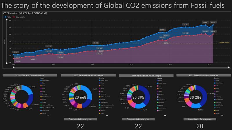
In the primary graph, you can observe the escalation of CO2 emissions from 1970 to 2021. The blue line represents annual global values, while the red line indicates 80% of these values, which I typically use for analysis based on the Pareto principle. Additionally, the yellow line denotes the median global values reached in 2004.
Chapter 2: Distribution of CO2 Emissions by Country
Section 2.1: CO2 Emissions by Country (1970-2021)
The first pie chart illustrates the distribution of CO2 emissions among countries from 1970 to 2021. The United States remains the leading contributor, but this dominance is expected to wane. China’s ambitious plans, highlighted in its recent five-year strategy for expanding coal power plants, indicate that the competitive landscape is shifting. Consequently, Russia benefits from acquiring raw materials at lower prices. As such, 2022 is poised to set another record for emissions, despite previous expectations of a decline.
Section 2.2: Pareto Analysis of CO2 Emissions
The pie chart for the year 2000 reveals that 22 countries were responsible for 80% of global CO2 emissions. This represents a Pareto distribution, emphasizing the concentration of emissions among a relatively small group of nations.
In contrast, the 2019 Pareto chart demonstrates shifts in emissions contributors before the pandemic. China’s rapid emissions increase is evident, confirming my predictions regarding India’s substantial rise as well. However, I remain skeptical about the reliability of Russia’s data due to its limited transparency.
The 2021 Pareto chart indicates a decrease in the number of countries responsible for 80% of emissions, now down to 20. This trend underscores the growing concentration of emissions among fewer nations.
In conclusion, while I will provide a more detailed analysis later, it is troubling to see my predictions materializing.
For more insights, visit my content navigator posted on Medium, where I discuss climate change from a data science perspective.